A Story, and a Tutorial
This post begins with a story and ends with a helpful spot-color printing tutorial. If you’re a designer in a rush, by all means, scroll!

The Story
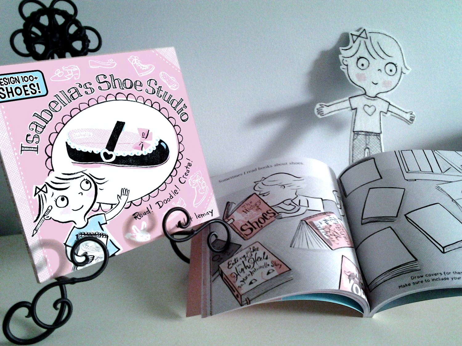
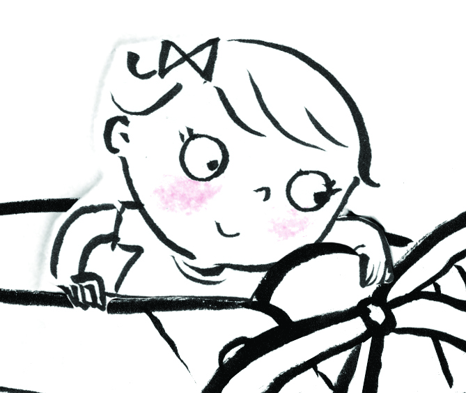
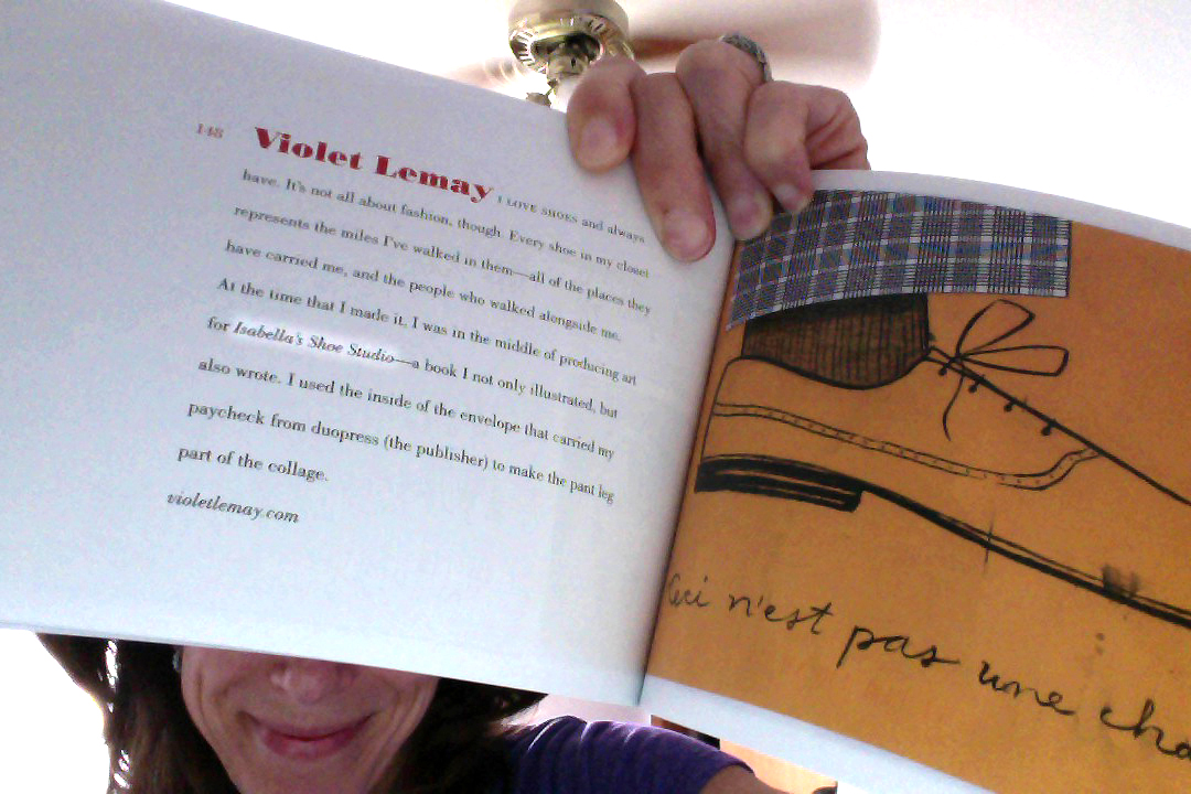
In the spring of 2013 I was putting final touches on the art for a project that will always be near to my heart: Isabella’s Shoe Studio (duopress/2013).

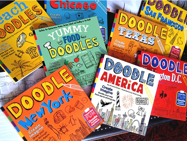
Isabella followed a string of Doodle books which I also illustrated for duopress. Every book in the Doodle series has a 4-C cover (standard 4-color process printing), and a black and white interior — basically, a pre-press breeze.
Like the Doodle series, Isabella would be an activity book, but would also tell a story.
Isabella’s Shoe Studio is something completely unique: a Doodle Storybook™. We decided to use the the Doodle books’ 8″ square trim size and French flaps to give Isabella duopress’s house look; to set her apart we would do something special in the realm of color.
Some crazy person had the idea to give Isabella’s Shoe Studio a 2-C interior. Somebody else (or possibly the same crazy person?) suggested a 3-C cover. I love the retro look of two- and three-color printing, and we all agreed and it would be a fun, inexpensive way to set Isabella apart.
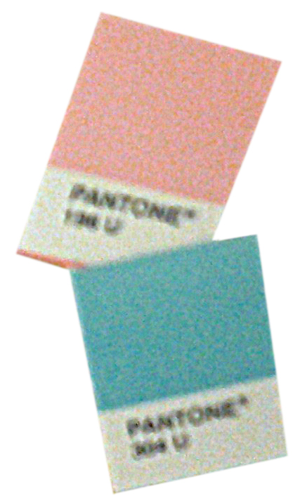
 2-C = printing in two-colors; in our case, black + PMS 196, a gentle petal pink.
3-C = (you guessed it!) three colors.
For Isabella’s Shoe Studio’s 3-C cover, we added PMS 304, a turquoise-y blue, to add a some punch to our soft pink.
Class, don’t trust your computer monitor! The color you see on your monitor is generated from a luminous mix of RGB (Red, Green, Blue), not CMYK—see below—and the appearance of color varies from one monitor to the next. To select colors with confidence, use a Pantone swatch book. These are expensive, but well-worth the cost. If you can’t afford a swatch book and you’re working with a local printer, stop in and ask to have a peek at theirs.
Printing: Color Basics
Process color (CMYK)
If you’ve ever had to replace ink cartridges for a desktop printer, you understand the mystery of 4-color printing, known as PROCESS color, or PROCESS printing. The full spectrum of standard* colors are created by a mix of CMYK inks: Cyan, Magenta, Yellow and blacK. This is The Process. Standard Operating Procedure. Every printer on the planet (and every pre-press operator) is programmed to print in CMYK.
*Special colors like metallics and fluorscents can’t be created from a standard CMYK mix. Those colors have to be added in a separate print run, and are called SPOT COLORS. You’ll find them at the back of your Pantone swatch book. 🙂
Spot Color (1-C, 2-C, 3-C, etc)
Rather than resulting from a CMYK mix, a SPOT color comes from a can; or more likely, an industrial-sized drum. Spot color is pre-mixed ink that is identified by a PMS color number—very similar to the way house paints are organized and presented. A spot color can also be a recipe of multiple inks stirred up into a color cocktail.
In book publishing 2- and 3-C printing is much more rare than CMYK, but spot color images surround us every day on screen-printed textiles and bottles. Imagine a two-color graphic printed on a T-shirt, or Coke’s trademark red and white logo printed on a bottle.
The Story, cont’d…
duopress is a fairly young company. In the spring of 2013, although we were working with a highly excellent printer, our inexperience coupled with a language barrier added layers of confusion to our tech-talk.
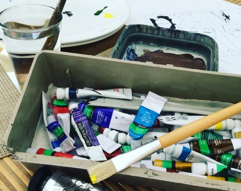
My only experience at the time with 2-C printing was from the year I spent managing a full service print shop at the Savannah College of Art and Design in the mid-nineties. Every term, graphic design students were given a 2-C, screen-printed logo assignment. Our shop techs printed those bad boys by hand, dragging goopy Chroma/Tech ink with a squeegy over templates that had been burned onto film—usually multiple times before achieving a perfect print—for every student. (Think T-shirt screening by hand, times a million.) This task kept us busy around the clock for weeks at a time, and it remains etched in my memory.
The Chroma/Tech assignment taught me how to manually set up files for 2-C printing; in other words, how to separate the colors.
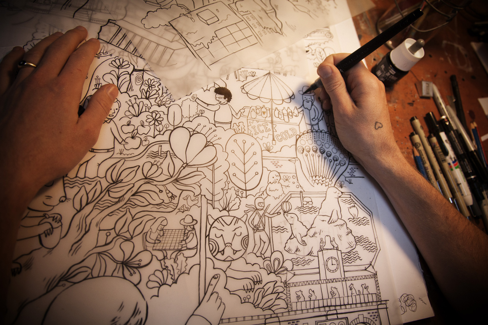
Manual Color Separations

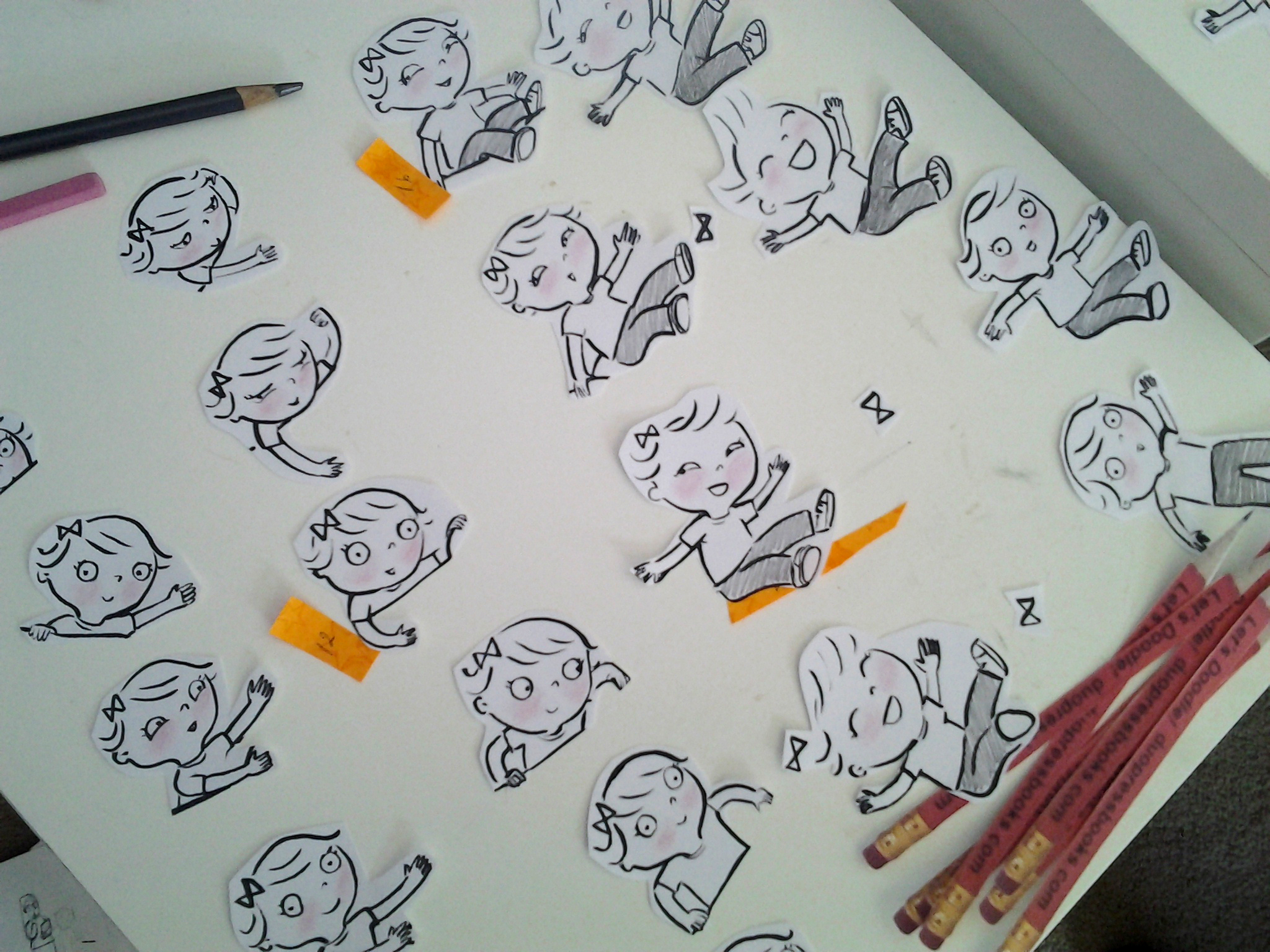
The image above is an actual example of the color separation plates that we made for Isabella’s Shoe Studio. I created 2 separate plates in grayscale mode for every image in the book: a pink plate that showed the printer where to put the pink ink, and a black plate for the black ink.

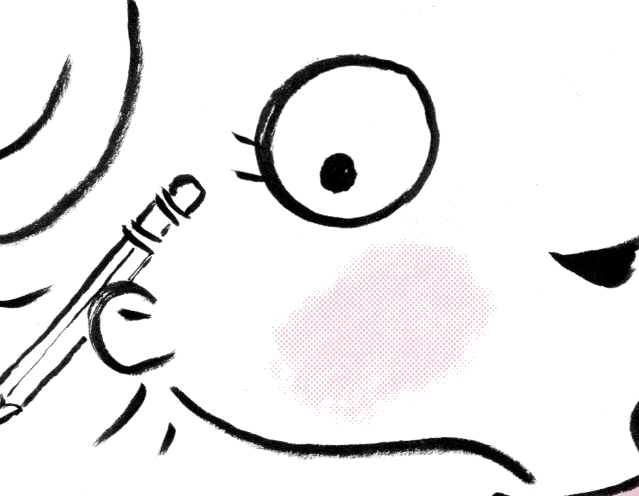
Any gradients or tints of pink had to be converted to a HALFTONE DOTS, just like vintage comics. We converted the pink cheeks for all of the characters in the book, which had been created by smudging charcoal, to halftones—see above. (Halftone How-To: Convert image color mode to BITMAP. Select “halftone screen” on the new menu that pops up, then play with the sliders until you’re happy with the size and density of the resulting dots.)
Isabella’s Shoe Studio’s designer Charla Pettingill created two InDesign documents of the book’s interior to send to the printer: one for the black ink, and one for the pink. She placed any type that would be printed in gray or black in the black document, and pink type was set in the pink document.
This process is great if you want to give your project an authentic retro look, with a bit of off-register color here and there, but be advised: there is a ton of extra work (look up TRAPPING before you make your decision!), and you will have to explain to your printer what you are doing. Modern pre-flight technology is automated, even for 2- and 3- color print jobs. A printer’s RIP (rastor image processor) software creates separation plates automatically. If you submit manually separated plates, you run the risk of throwing everyone into a tizzy.

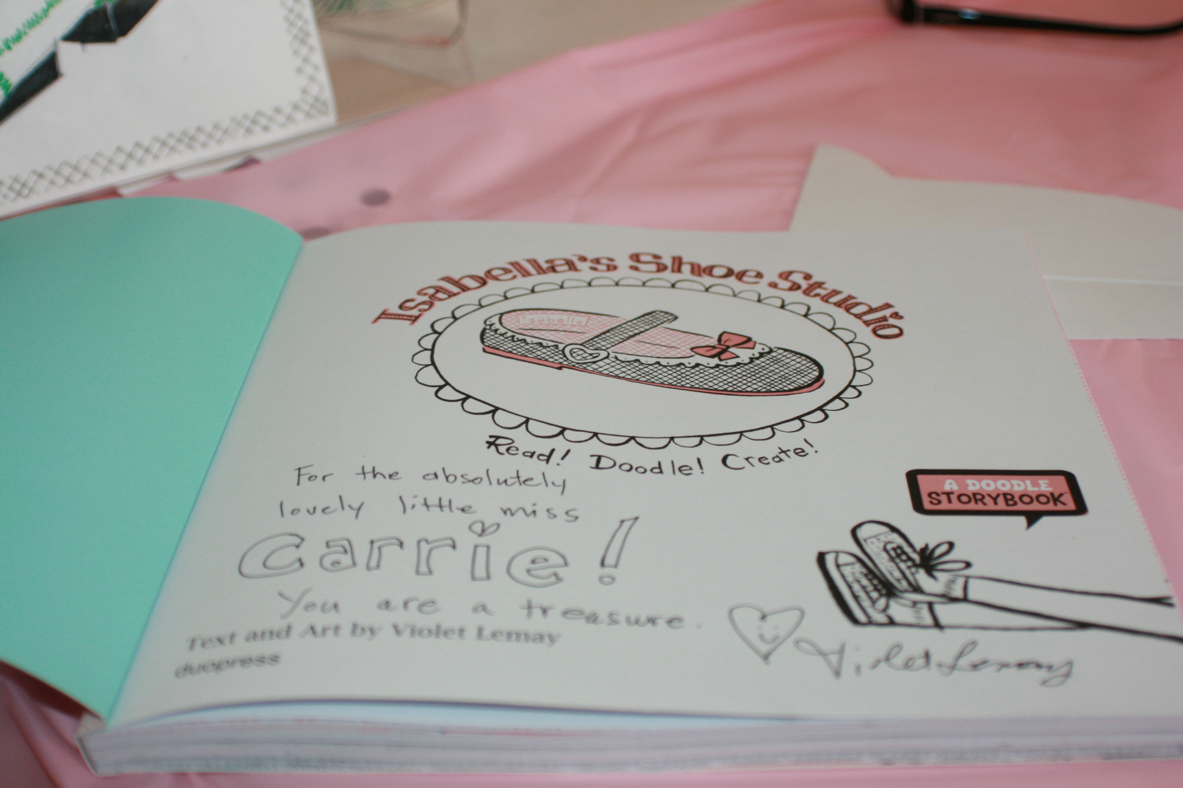
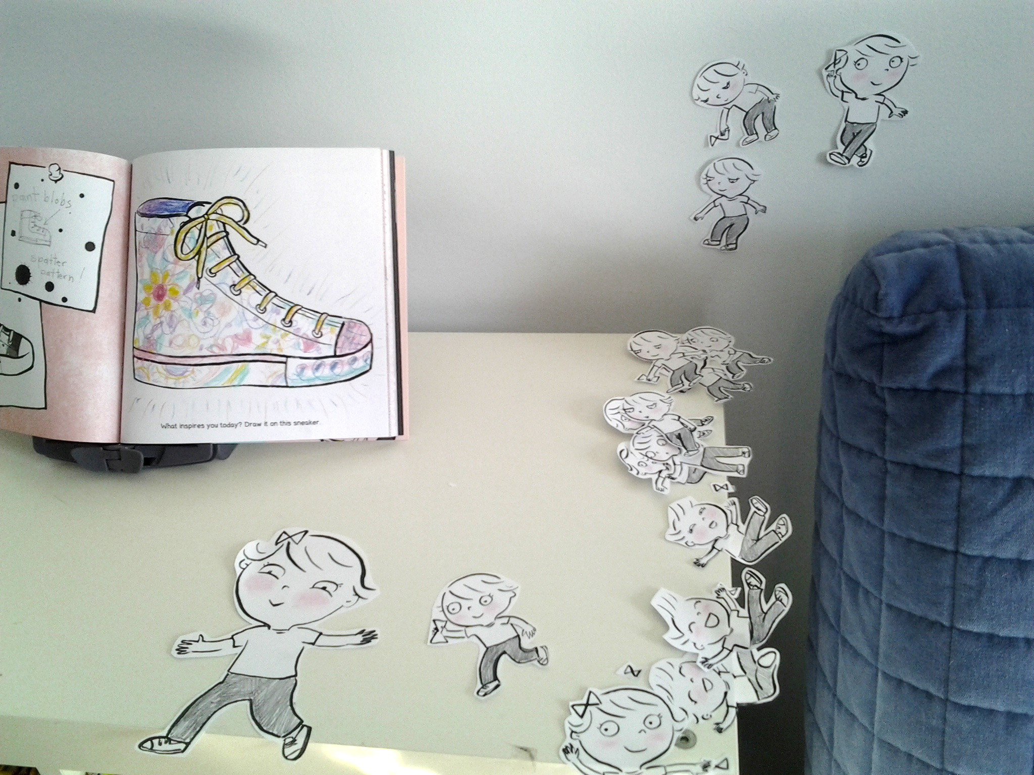
I write this from experience! We had a a bit of trouble with Isabella’s Shoe Studio‘s printing process—but class, I have to say, in my humble opinion it was all worthwhile. The way those inks rest on that creamy white paper and interact with one another is a joy to behold. Isabella’s Shoe Studio is the kind of tactile experience that causes designers to salivate. The above photo shows 1-C on the inside front cover (PMS 204). The 2-C title page (PMS 196 + black) is reflective of the entire interior of Isabella’s Shoe Studio.
IMPORTANT NOTE: People in general and printers specifically prefer not to be thrown into tizzies. If you are using spot color, even if you have tons of experience, ask your printer to provide a file set-up guide. There are multiple accepted methods, and preferences vary. Copy and paste this sentence into an e-mail: “Please send your pre-flight requirements for spot color printing.”
At duopress, we’ve produced several beautiful books that include 1-, 2-, and 3-C elements since paving the way with Isabella’s Shoe Studio, all with much less stress. Here’s how we currently set up 1-C spot color files:
The Tutorial
Prepping Images for 1-C (spot color) printing
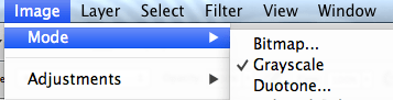
Grayscale Mode
Open the art files in Photoshop. If necessary, convert to grayscale (Image –> Mode –> Grayscale). If you file is not in grayscale mode, Photoshop refuses to allow you to convert it to monotone mode, which is your end game.
Level Check
Adjust levels (Command + L) until you have a true black and white image. Open the info menu (Window –> Info). Hover your cursor over the image and check the color mixes in the info panel: in black areas, the K on the left should read 100%; in white areas, it should be 0%.
Monotone
With your PMS color number in hand (Class: swatch book!), change your image’s color mode to DUOTONE. (Mode –> duotone.) Note: Eventually your file will be a MONOTONE, but for some reason this is not given as an option in the drop-down menu. Do not panic, just keep reading.
When you select the duotone option, a “Duotone Options” menu appears.

Set MONOTONE as your file TYPE. Click on the color box next to “Ink 1” to reveal a color-selection menu and corresponding eye-dropper tool.
 Select “Color Libraries” to reveal yet another menu—this one is a list of the world’s color systems.

Scroll to select your printer’s preference. If you’re unsure, ask! At duopress we use PANTONE solid coated, which is pretty standard.
Scroll to find your color number, or type the number and its swatch will appear at the top of the list. (Note: type fast! pauses between numbers cause Photoshop to get confused.) Photoshop requires that you enter a name for the color into the field next to the swatch.
Voila! Your grayscale image is now a monotone. It may look slightly different than your color chip but don’t worry, that’s why you invested in that swatch book! The ink will match the printed color swatch, not the color you see on your monitor.
Monotone files can’t be saved as a TIF. Save the art as a .psd file (.eps works, too), and place it in your layout.
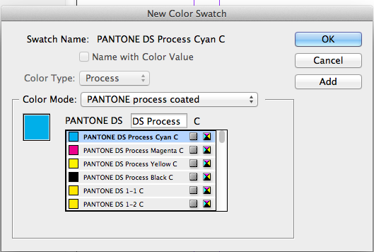
Pantone colors can be imported into InDesign’s swatch palette, for any lettering or graphic elements created in InDesign that are to be printed in the spot color.
In InDesign, click the arrow in the top right corner of the SWATCHES menu, then select “New Color Swatch” at the top of the list. Select your color mode, and import the chosen spot color into your palette.

__________
Violet Lemay, the author of this post, is an illustrator, and is also the art director at duopress. Credit for all duopress book concepts goes to the publisher, Mauricio Velázquez de León. Click here to see all of duopress’s books.
Tags: 2-color printing, Duopress, Isabella's Shoe Studio, manual color separation, preflight, prepress, printing tutorial, spot color, two-color printing
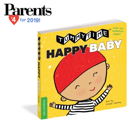 duopress rolled out their new TummyTime™ concept to the world only a few weeks ago by way of two books: Animal Parade (illustrated by Jannie Ho) and Happy Baby (illustrated by Violet Lemay), and the books are already getting noticed. Hooray!
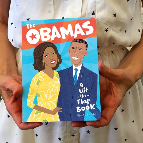

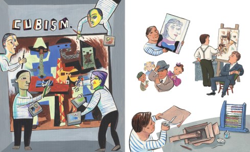

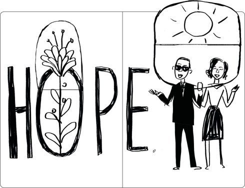
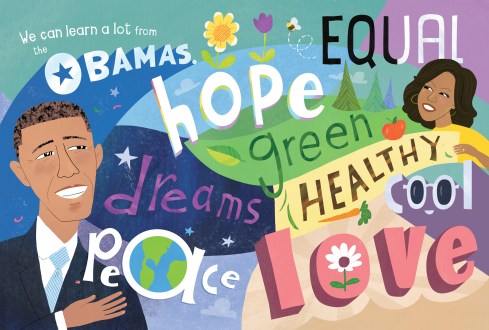
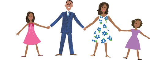 We considered the title 100 Obamas (instead of 100 Barack Obamas) but I was the only one who could visualize the resulting book. In my imagination it looked incredible, but sketching the whole thing in an attempt to sell the idea would have been such a giant time commitment that I wimped out immediately. Time to switch gears.
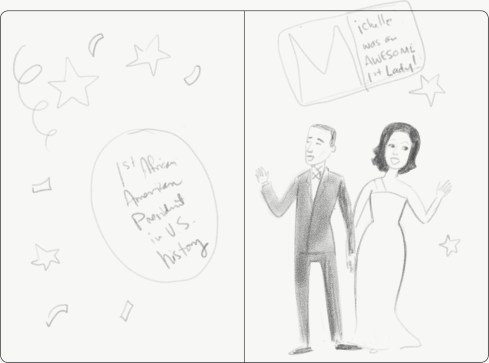

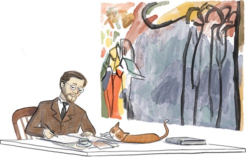 Kandinsky: 1920


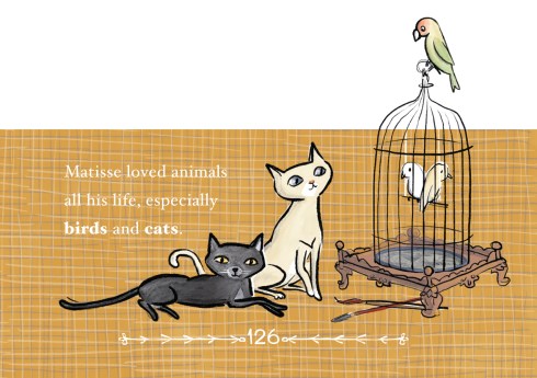
 Klee’s cat Bimbo and Kandinsky’s cat Vaske used to study each other from across the Bauhaus campus courtyard, looking through their apartment windows.

 Soon they’d begin dying their hair and piercing body parts, but in those first weeks of the fall term, they looked clean cut and bashful—except for a one or two young goths, who were ahead of the game. 😉
 Their interests ranged from sound design to historic preservation of architecture. Of course, the more typical art majors were also represented: painters, illustrators, fashion and graphic designers, etc. A broad range, some of whom had no interest at all in drawing. Or 2D design. They were there to fulfil a schedule requirement, not because they were interested in the subject. In fact, some were openly annoyed to be there. And I was completely new to teaching. It was terrifying.
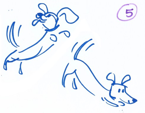
 Handing out sheets of paper, I explained:
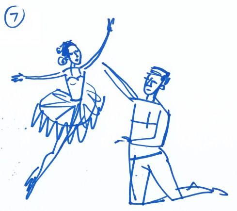
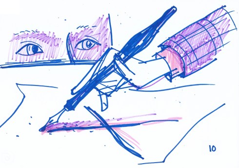
 I was nervous. At first they all just sat there. I paced. But then, little by little, they started drawing. A gentle young sound designer from somewhere in the south—or maybe he was from California—met my eyes with a smile. His name was Michael. He had crazy long curly hair, and antique glasses. “I never knew something as simple as a line could be so expressive,” he said. And my heart melted, and I stopped pacing. Mission accomplished.


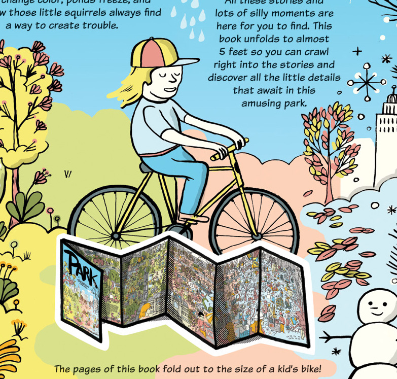
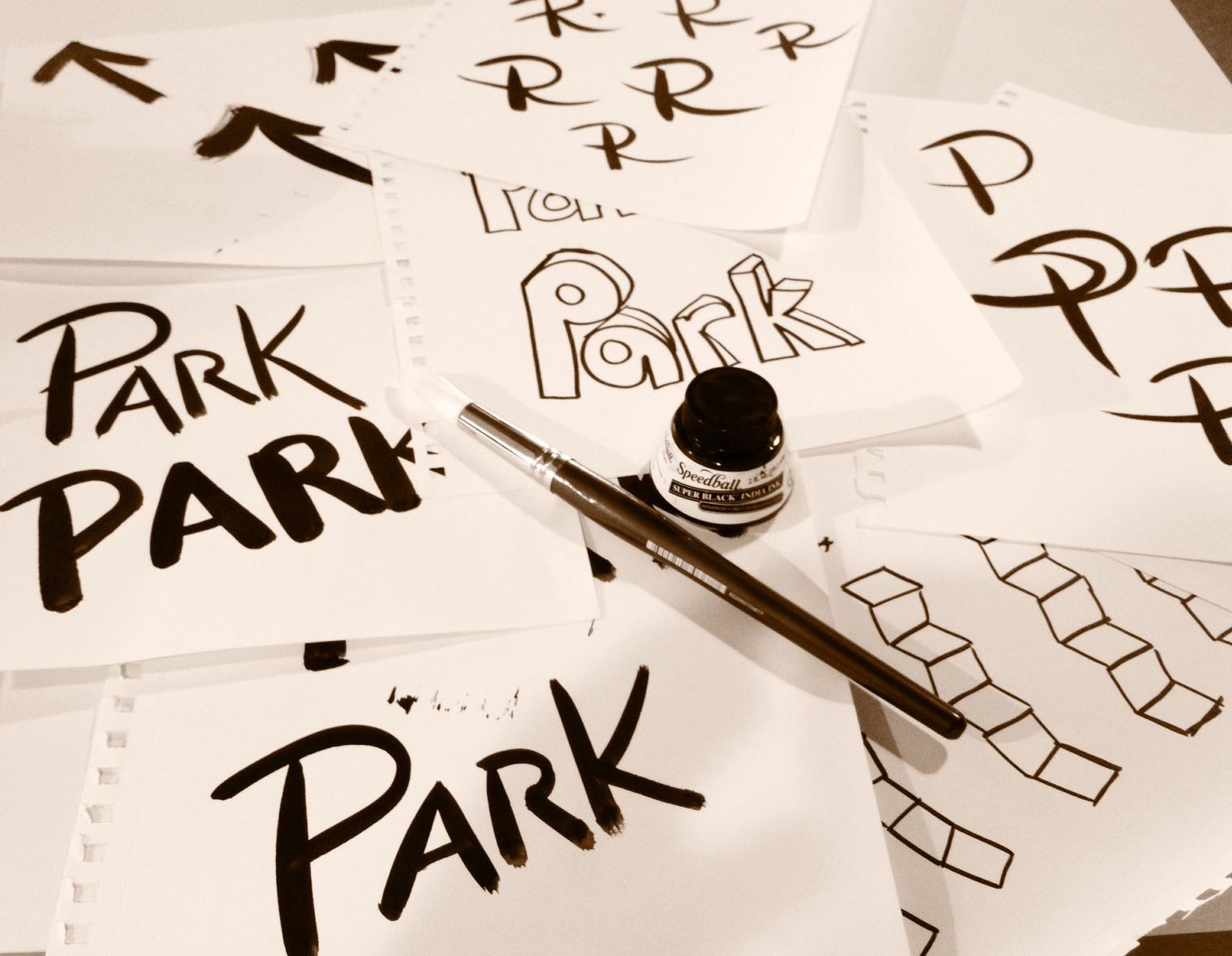
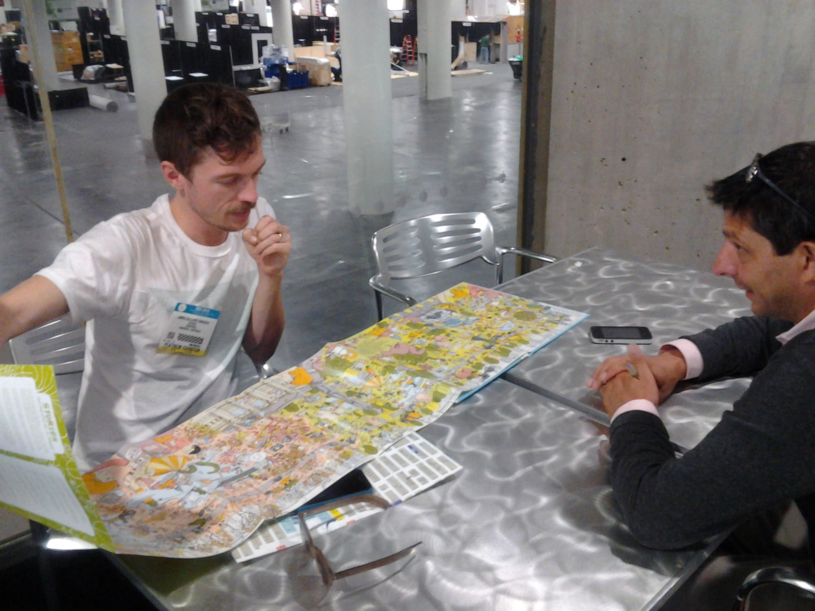
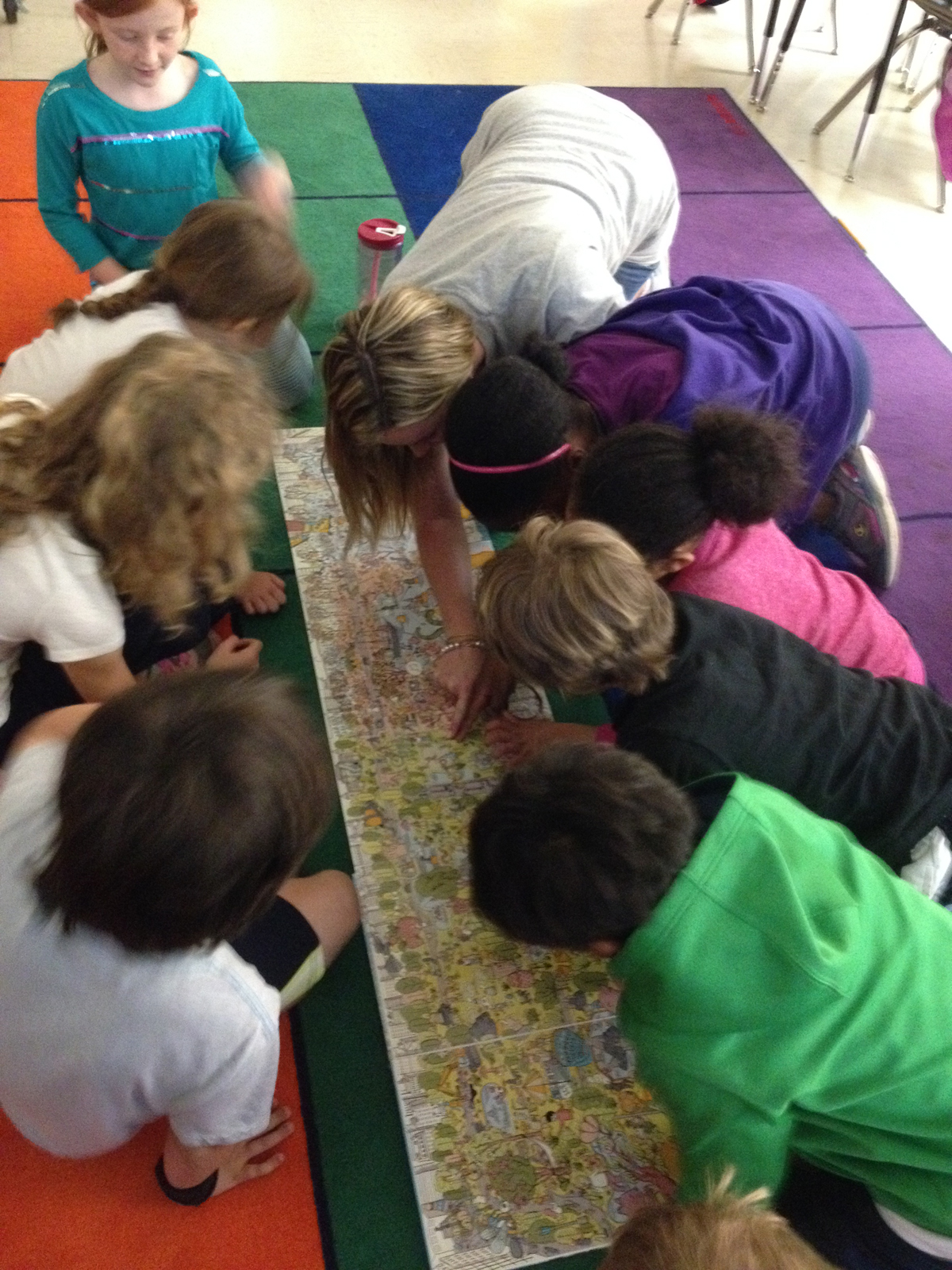
 … and a peek at how the whole thing came together.