Tag Archives: design

The Story Behind “The Obamas: A Lift-the-Flap Book”

9 Oct

obama cover w white dress

Finding the Format

The Essential Backstory

100 Pablo Picassos.

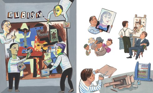
In 2014 I had the pleasure of illustrating 100 Pablo Picassos. Author Mauricio Velázquez de León cooked up the delicious idea for this interactive biography which invites kids to find one hundred instances of Picasso peppered throughout a fanciful 32-page book, resplendent with Picasso-inspired art.

cubism spread

Since then I have moved to New Zealand, voted for Hillary (from abroad! yes!), and have illustrated many other books, but One Hundred Pablo Picassos has always stayed with me. It helps that it’s been translated into several languages and was included in an exhibit at Korea’s Museum of Kids’ Books and Art.

The Lightning Bolt Moment

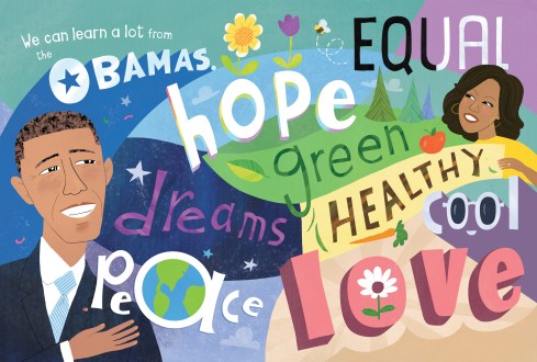
One quiet morning in April 2018, after listening to month after month of depressing political shenanigans from the US, I was remembering the hope and pride I used to feel when watching the news during the Obama years.

President Obama was a role model, admired and respected globally. The current holder of the office? Not so much. Nostalgia washed over me and I thought, we should make a book. We should make 100 Barack Obamas.

Mauricio loved the idea of an Obama book for kids, but didn’t think the “100” concept would work. We had included self-portraits in 100 Pablo Picassos‘ overall count, which was very clever and added spice to the “find this guy one hundred times” concept.

100pp_self portraits

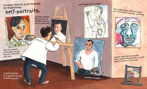
The self-portraits were an essential ingredient that could only be included for a visual artist. Mauricio also pointed out that Picasso’s entire life was perhaps a bit more colorful than that that of anyone who gives speeches for a living.

Yep. Fair enough.

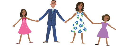
More importantly, we wanted to include Michelle as an equal partner, and the girls.

tiny ObamasWe considered the title 100 Obamas (instead of 100 Barack Obamas) but I was the only one who could visualize the resulting book. In my imagination it looked incredible, but sketching the whole thing in an attempt to sell the idea would have been such a giant time commitment that I wimped out immediately. Time to switch gears.

After researching popular kidlit biographies and the Obamas, I wrote three or four manuscripts (okay, six) of varying lengths, targeting different audiences with different types of books. Don’t be fooled: this took some quality time.

first Obama sketch

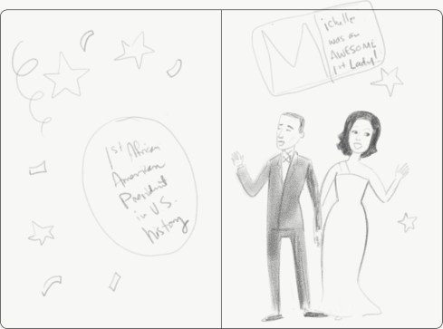
one of the first sketches made for The Obamas: A Lift-the-Flap Book

Ultimately we settled on the most concise manuscript, which utilized the device of flaps to make the book interactive.

Finding the Look

The Technique

Next decision: How should the art look?

After getting a concept approved for The Obamas: A Lift-the-Flap Book, I tried out several techniques and presented them to the publisher. Simple flat color? Or my usual use of textures and patterns with minimal rendering? Or… how about adding paint texture? Using, like, real paint?

paints

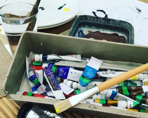
We liked all of the choices but—of course—settled on the paint option, which was by far the most challenging. And time-consuming.

In case you’re wondering, writing and illustrating a book about Barack and Michelle Obama was, for me, incredibly intimidating. My artistic desires for this book outweighed my abilities. Thankfully, art director Tyler Garrison was there. Tyler’s guidance was invaluable. Never underestimate the value of good art direction. Can I get an Amen?

The Design

Speaking of trying out options, I also submitted a buffet of flap designs for every single spread. So. Many. Sketches. I will be forever grateful to duopress for their patience with my monkey brain.

early Obamas sketch_HOPE

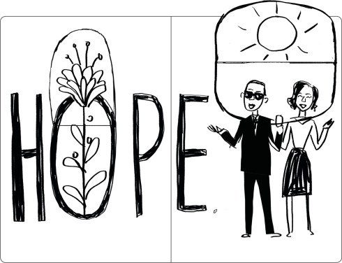
one of the unused layout options for “The Obamas: A Lift-the-Flap Book”
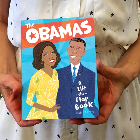
Finding the Book!

9781947458826_3D

.

.The Obamas: A Lift-the-Flap Book was released on Oct. 1, 2019 by duopress and is available everywhere books are sold, thanks to distribution by Workman Publishing.

Click here to see more samples from The Obamas: A Lift-the-Flap Book on my website.

LEARN_marketing

Click here to order your copy today!

sidestepping obstacles

31 Oct

Build upon strengths, and weaknesses will gradually take care of themselves. ~ Joyce C. Lock

Illustration is a tough business. Super-duper. When I teach illustrators who are about to graduate and face the real world — students who have had years to explore, practice, and hone a style — I ask them to assess their portfolios, and list their personal strengths and weaknesses.

Everybody excels here and struggles there, but not everyone is equally self-aware. Self-awareness is a sign of maturity. In a tough marketplace, it is essential for survival.

When you are honest about your strengths and weaknesses as an artist, you can become your best self.

Life coaches and business experts often instruct us to identify our weaknesses so that we can strengthen them. I prefer to spend time strengthening my strengths. It’s not that I’m lazy. It’s just that I know who I am, and who I am not.

We are creative people, Class. Let’s find clever ways around our personal obstacles.

I’ve already confessed my lack of skill when it comes to color. The easy way around this obstacle is to use existing palettes created by people whose color sense is better than my own. When I use a proven palette, there is no struggle evident in my work. I learn as I go, and make fewer lackluster illustrations in the process.

Nathalie Dion told a similar story to my class via Skype several years ago; she has kindly given permission for me to retell it here.

When she was a student, Nathalie struggled with perspective drawing. As a result she all but eliminated perspective from her artwork, a decision that impacted her style in a profound way. Mme Dion found a path around her obstacle, a decision which went on to pay big dividends.

In both cases — my struggle with color and Nathalie’s, with perspective — we imposed style rules on our work. When I add color to a drawing, I force myself to stay within the palette I have chosen. This can be challenging, but the results are exciting, because the limitation forces me to make choices that wouldn’t even occur to me otherwise. The same is true for my sweet friend Nathalie, whose self-imposed challenge forces her to find interesting and clever ways to suggest depth, with limited use of perspective.

Know your weak areas and use them for good. Some obstacles are put in your way to make the path you travel more interesting.

__________

The Big Breakup (above), by Nathalie Dion. Nathalie is represented by Anna Goodson Management, Inc. See her entire portfolio on Anna’s site by clicking here.

{ l e g a l } THIEVING

23 Oct

“Of course, I subscribe to Graphis, Communication Arts and Print, and whenever I see something I like, I steal with both hands.” ~ David Lance Goines, 1992 (from a personal letter)

As visual people, we can’t help but be influenced by the art and design that we love. If you want to be a successful illustrator with a lasting career, you have to stay on top of color and style trends, and adapt as the culture’s taste changes. Artists are always learning, always growing, and are always influenced by their environment. Therefore, we had better monitor the environments in which we put ourselves!

Some of us have to be more careful about this than others, because we are like tofu.

Tofu  has no inherent flavor; rather, it takes on the flavors of the other ingredients in the recipe. Throw in some curry, and the tofu tastes like curry; saute tofu with bell pepper, and it tastes like bell pepper.

Many art students are like tofu simply because they haven’t had time to develop yet, artistically. If you suspect you may be the tofu-type, my advice is to stop looking at other illustrators for inspiration. Assailing your brain non-stop with illustration can be confusing, and can even cause unintentional plagiarism.

Instead, look at fine art and graphic design. Spend an afternoon at the botanical garden, or flipping through the latest issue of Elle Decor. Steal a color palette from a pair of designer high-tops, or a roll of wrapping paper. Be influenced by good design, without bombarding yourself with images made by your illustration heroes.

This will help your work improve as you become uniquely you.

I stole the color palette from the crazy shower curtain in our upstairs bathroom (see photo above) for this holiday image. Many artists struggle with color, and I am no different. I have learned not to trust myself when it comes to color. As a rule, I always “steal” an existing palette designed by a professional colorist. It’s a good trick, and falls under the heading of LEGAL THIEVING.