Tag Archives: publishing

Thank You, Brown Books!

11 Sep
Violet meeting everyone at Brown Books in Dallas.

Texas Publisher Extraordinaire

Shortly after I wrote and created a sketched book dummy for “Alithia Ramirez Was an Artist” in the summer of 2022, my wonderful agent Mela Bolinao of MB Artists sent it out to all of the big publishers.

A snippet of the storyboard I created for “Alithia Ramirez Was an Artist.”

This real response was a typical reaction:

“I’m so sorry to say this won’t be going forward. We had quite a discussion about it, and while everyone found the book to be incredibly moving, we were struggling with how to position the book, since so much of the story’s power depends on knowing who Alitihia was… it’s a quiet book, but with this additional messaging, and we worry that retailers won’t quite get what it is or how to shelve it. But I hope Violet finds a publisher who has a vision for making this work—maybe more school library market?   

I’m sad the news isn’t better, but I appreciate getting the chance to see this!”

~A Much Loved Big 5 Acquisitions Editor

Focus: Texas

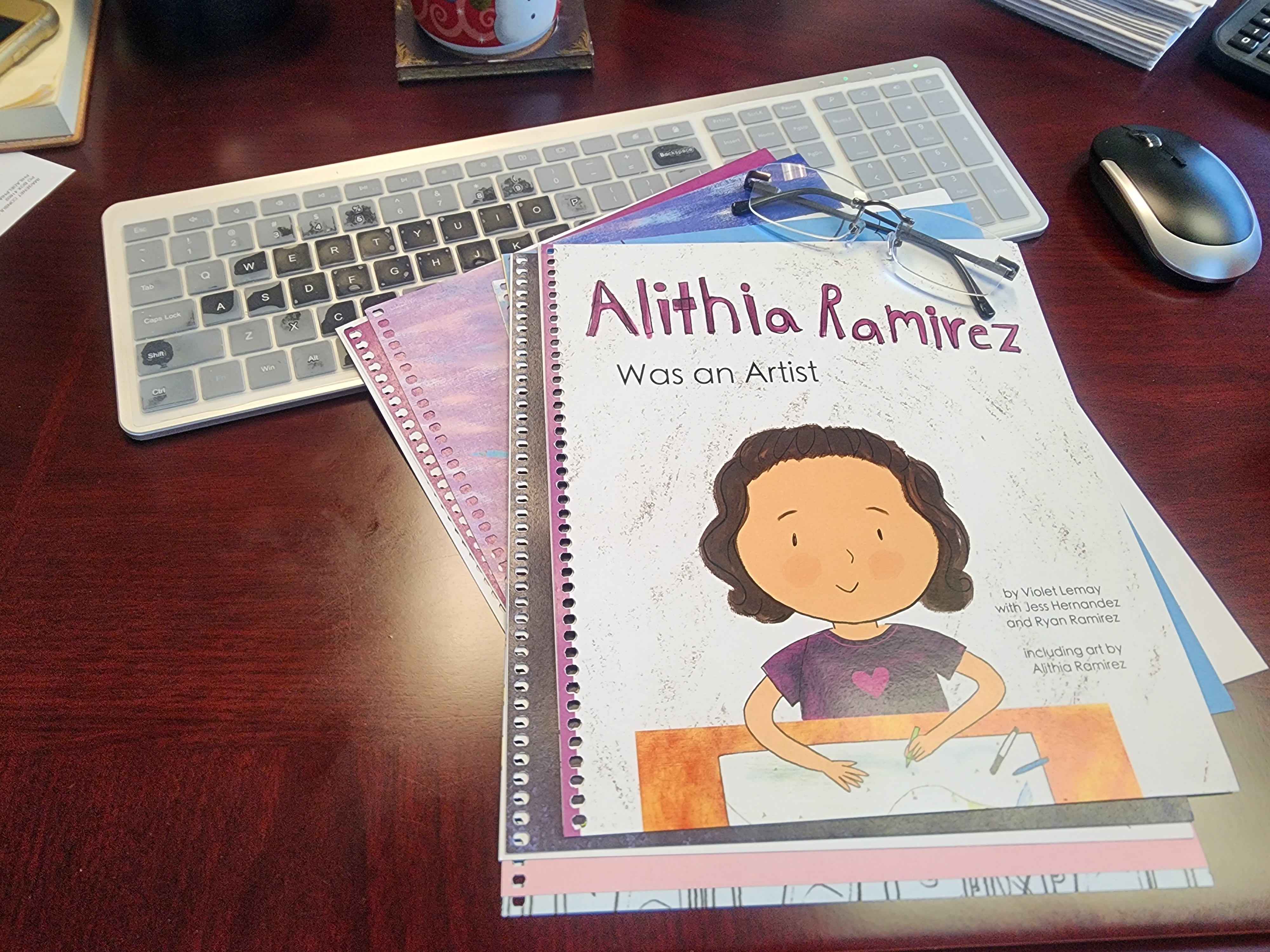
Alithia Ramirez Was an Artist wasn’t just any book project. Alithia’s family was involved! I knew I had to find a publisher. Mela and I researched independent Texas book publishers and I discovered Brown Books, a Dallas-based hybrid press. I queried them to get an estimate in case it came to self-publishing. I figured if all else failed, I could work with Alithia’s family to crowd-source the expense.

Brown required a physical submission, so I sent my book file to Landmark Printing in North Carolina, my go-to print shop in the US, and they shipped a bound dummy to Brown in Texas.

President and COO if Brown Books, Thomas Reale, sent me this photo of the “Alithia Ramirez Was an Artist” book dummy on his desk.

On Nov 15, 2022, I received this email from Brown Books:

We are in receipt of Alithia Ramirez Was an Artist and would like to talk to you regarding publication.

Please call the number below and ask for me personally.

Sincerely,

Milli

On Thursday, Nov 17, I spoke to Milli. She explained that Alithia Ramirez Was an Artist might be the perfect inaugural release for Brown’s brand-new TRADITIONAL imprint, Michael Sampson Books! No crowd-funding needed!

I Zoomed with Brown’s President and COO Tom Reale on Wednesday, Nov 22; a contract from Michael Sampson Books was sent to to MB Artists on Wednesday, Nov 23, the day before Thanksgiving. Needless to say, it all worked out. My advance and any future royalties fund the Alithia Haven Ramirez Summer Seminar Memorial Scholarship.

—————

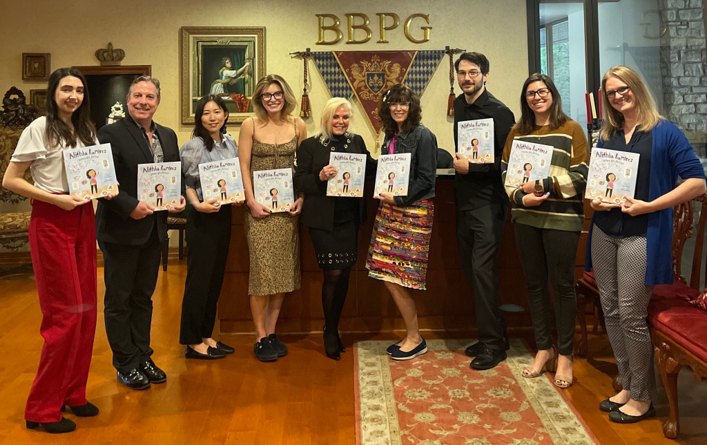
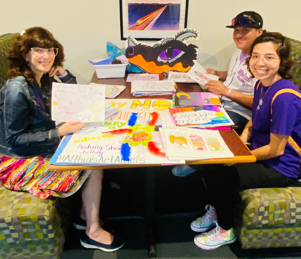
It’s now late October 2023, less than a year later. Alithia Ramirez Was an Artist was released on Oct 10, and we celebrated with a launch party at the El Progreso Library in Uvalde on Oct 12.

Violet with Ryan Ramirez and Jess Hernandez at El Progreso Library in Uvalde, judging last-minute entries from Alithia’s Art Angels 2023 art contest.

After countless emails, Alithia’s parents Jess Hernandez and Ryan Ramirez and I finally met. Which was nothing short of AMAZING.

Jess and Violet at Alithia’s mural in Uvalde, Texas.

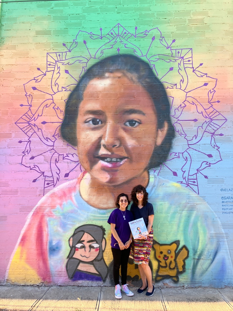
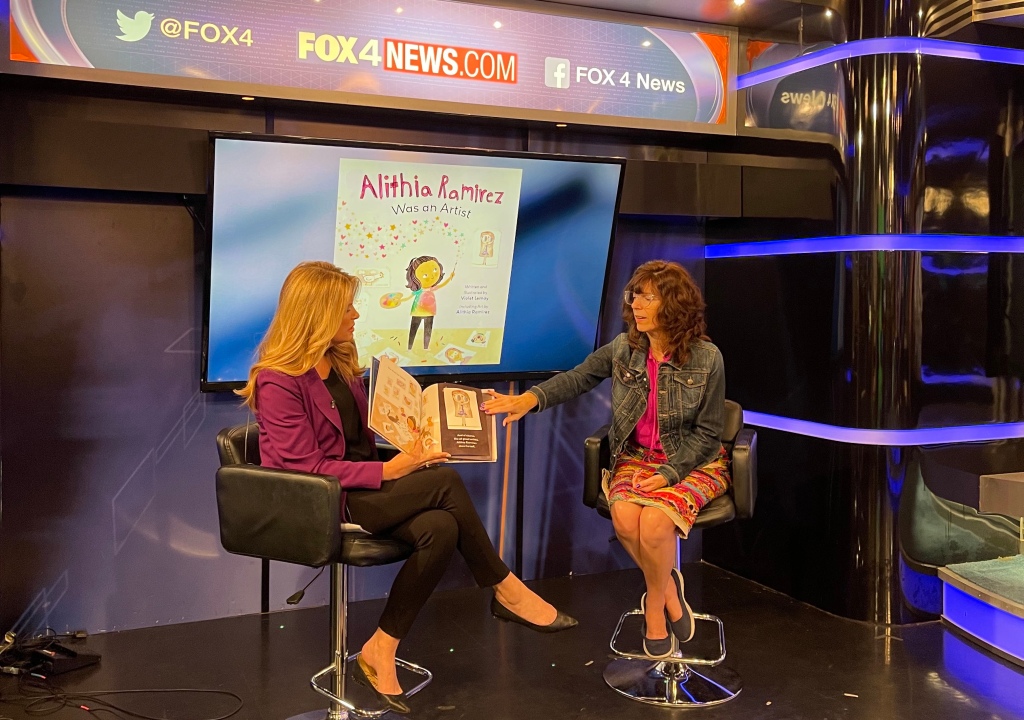
I just finished an extensive tour to promote and celebrate the release of Alithia Ramirez Was an Artist. While I was in Dallas I got to meet Milli Brown, Thomas Reale, and their amazing team. Before that, and before Uvalde, the tour took me to NYC where I met—drumroll—Michael Sampson!

Michael Sampson in NYC after breakfast at Ellen’s Stardust Diner.

It’s been an amazing whirlwind. I am exhausted but happy and am so, so blessed. THANK YOU Milli Brown, Tom Reale, and everyone at Brown Books (especially Amy, Kennedy, Sophia, Brittany and Danny); Michael Sampson of Michael Sampson Books; and of course, Alithia’s parents Ryan Ramirez and Jess Hernandez. Thank you! Thank you, Mela Bolinao! And thank you Lauren Przybyl and Fox 4 Dallas for the on-air interview .

On the set of the Dallas morning show with Lauren Przybyl.

Thanks to everyone who hosted me on my US tour, which has been the experience of a lifetime. Every librarian, teacher, and bookseller; all of my kidlit-creating colleagues; and every flight attendant, hotelier and Uber driver who has helped me along the way… THANK YOU!

Tom and me at the St. Louis Zoo. :o)

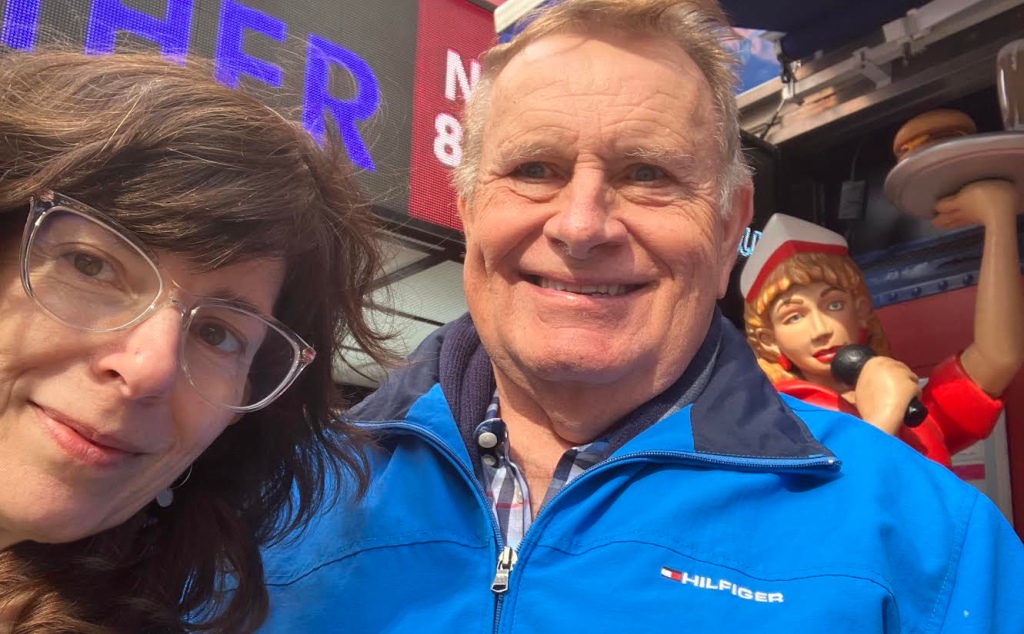
And thank you to my friends and family who hosted me along the way. My cousin Tom has been especially helpful. Thank you, Tom! 🩷💜🩷

The Making of NY Dogs

4 Sep

NYDogs_cover w Jorge
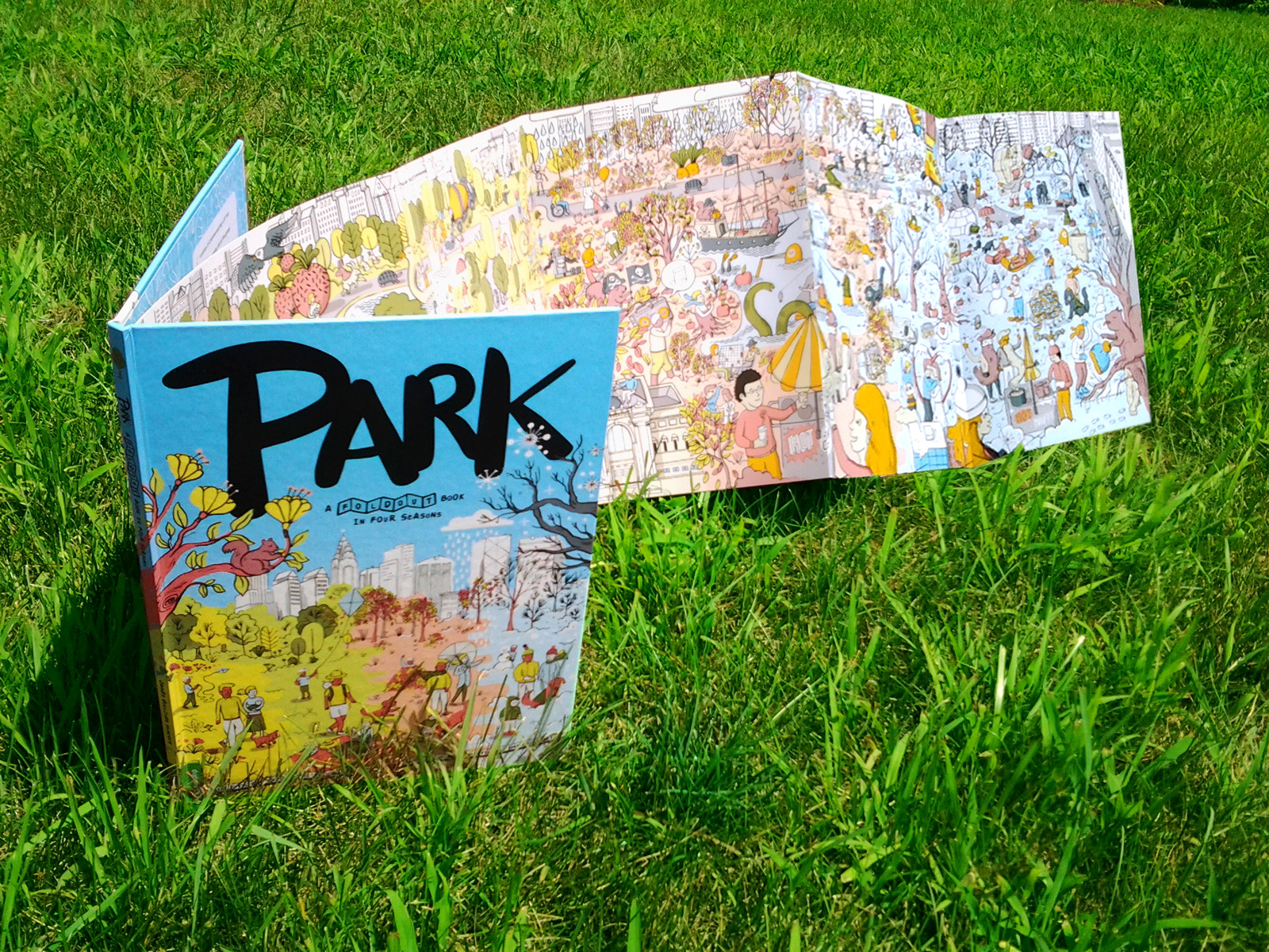
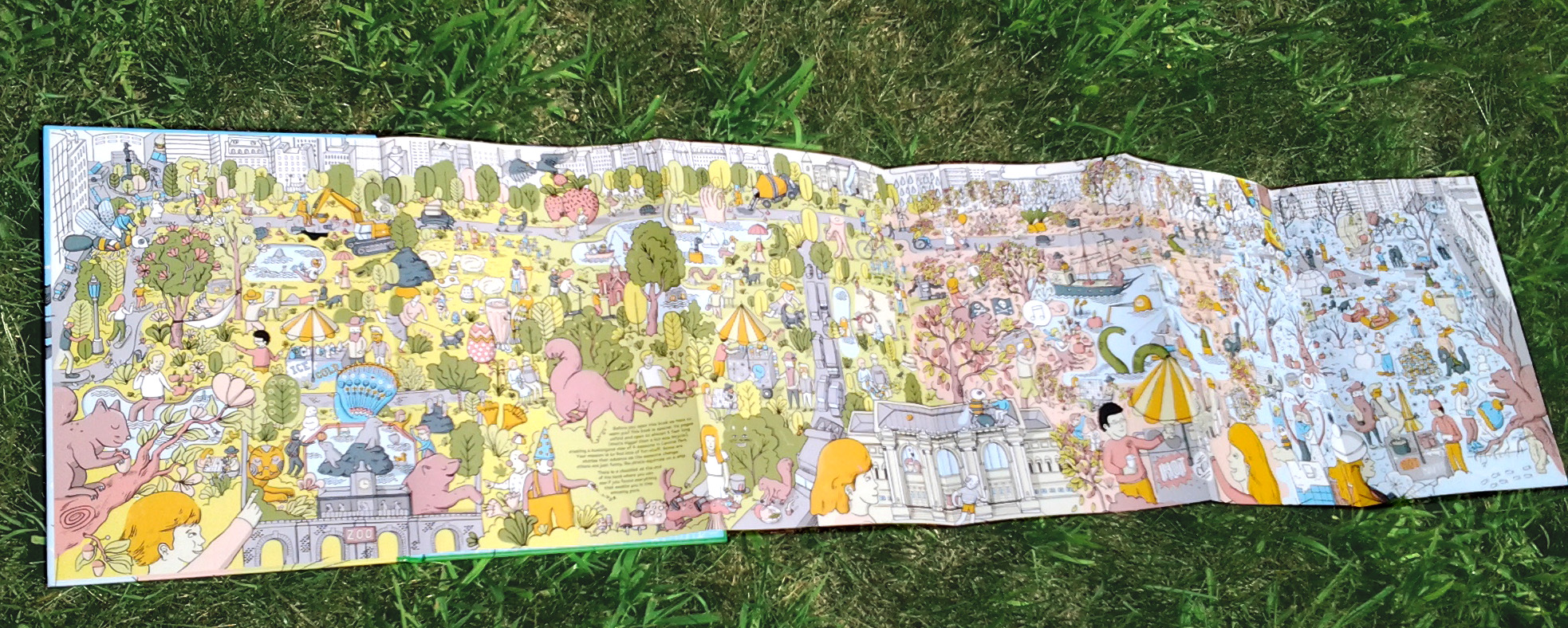
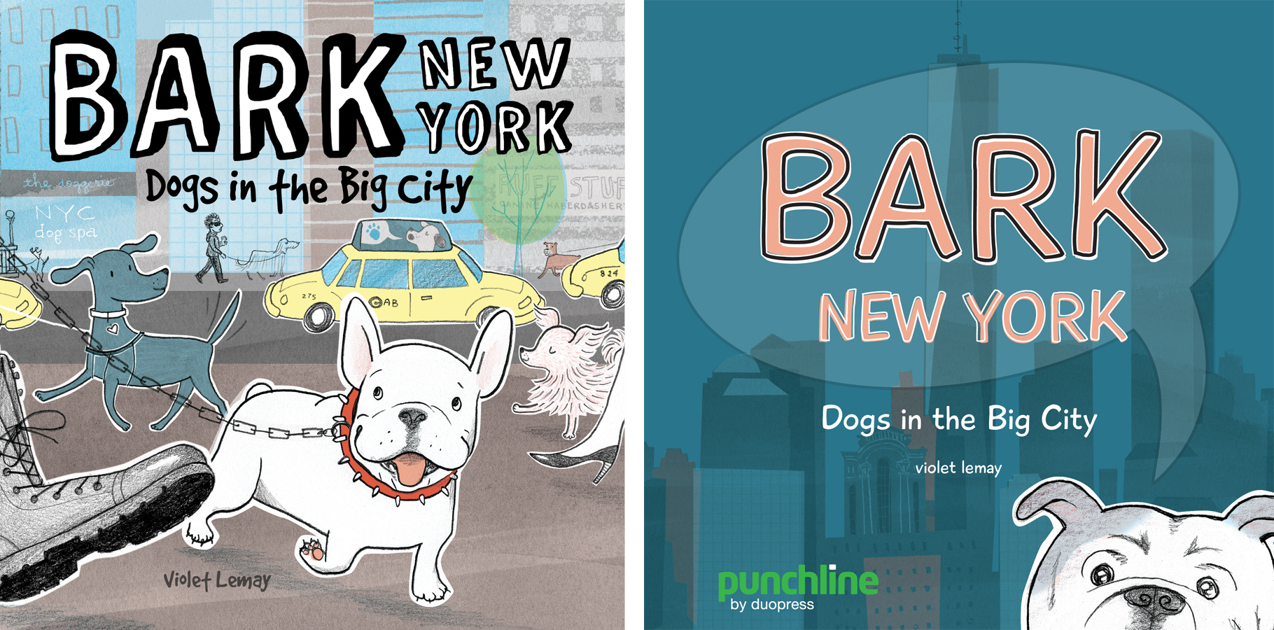
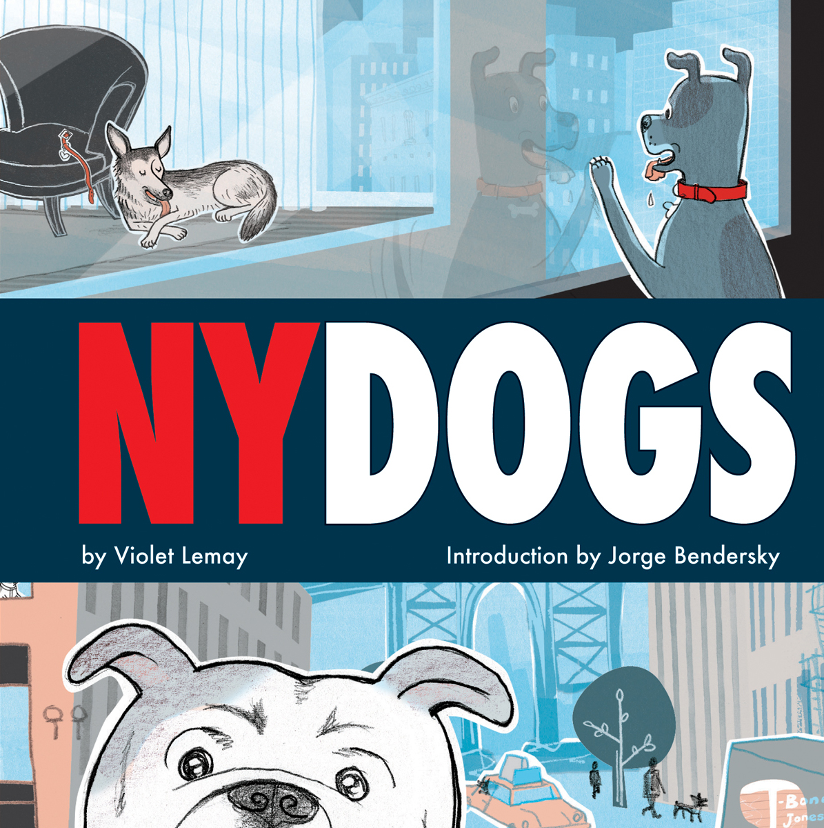
In July 2015, I was hit by an idea for a book about dogs in New York City. As an illustrator (and occasional author) of books for little kids, I imagined a picture book for children.

Local Baby coversAfter having illustrated New York Baby, Brooklyn Baby, and a string of other Local Baby titles for duopress, I could see this new project following a similar format. Or, not! I could see it going in other directions, too. But the years I spent working on Local Baby books for duopress helped spark the dog book concept, so I couldn’t wait to share this new idea with them.

duopress loved my canine brainstorm—hooray! THANK YOU, duopress!

But after writing the manuscript, settling on the title BARK NYC or BARK New York, and trying some sample covers, a shocking question entered the conversation: Is this a book for children? Perhaps BARK should be a book for adults?

Behind the scenes duopress, a publisher of innovative books and games for curious children, was busy opening up a subsidiary line of books and games for adults under the name punchline.

punchline

BARK became a punchline project. To break from the original intended audience of kiddos—which had been the focus of my career in recent years (click here to see my portfolio)—we changed our book’s name and cover design. After trying a variety of options, we settled on the title NY Dogs. The final cover is at the top of this post. Below are two of the many options we created during the transition.

bark covers

Besides getting a new title and cover, the content of NY Dogs also had to be re-written, and had to cover 96 rather than 24 pages. Suddenly I was writing for adult New Yorkers, a notoriously tough crowd. Awesome, yes, but the challenge didn’t stop there. With a publisher named punchline, NY Dogs had to be funny. Clever and witty are closer to my wheelhouse. I needed help! Thankfully there are some very smart and extremely funny people in my life. A handful of them got snagged into contributing to NY Dogs. One of these funny folks had no choice, because he is my roommate. And because we’ve been married for 21 years.

Fred Fruisen

EPSON scanner image

My husband Fred’s funniness is sprinkled through NY Dogs. Finally, his poop jokes have found a broader audience. Congrats, Babe! And… thank you thank you thank you.

Fred Fruisen is a PGA teaching pro and a golf humorist. His first book, 50 Reasons to Hate Golf and Why You Should Never Stop Playing, will be released in May, 2017. Check out Fred’s blog, and like the 50 Reasons to Hate Golf facebook page to follow his progress. I am so pleased and happy for him.

:0)

Doreen Chila-Jones

EPSON scanner image

And of course: my friend Doreen! A former Broadway performer and current stay-at-home mom/freelance writer, Doreen Chila-Jones is one of the funniest people I’ve ever had the pleasure of meeting.

Because of her close ties to NYC and love of all creatures—at last count her menagerie included two dogs, a cat, and a pair of guinea pigs—she was the perfect co-conspirator for NY Dogs. 

Doreen is always busy with writing projects, and she keeps a blog about the joys and challenges of raising teens with some very special needs. Her family’s story is amazing. Follow her!

Julia Jones

Screen Shot 2016-09-05 at 9.01.09 AMDoreen is the wife of my college bestie Julia Jones, who is also hilarious. These two are the power couple of Funny, and they are both very talented writers.

Although the demands of Julia’s Broadway stage management career prevented her from becoming an official contributor to NY Dogs, and her humility prevented her from allowing us to credit her at the back of the book along with Fred and Doreen, Julia provided guidance along the way. Follow her wonderful blog five plus banana splits to find out “what happens when experience of the theater crosses with children.”


________________________________

I had some help with one of the visuals in NY Dogs as well, but my studio assistant would scowl at me over the rims of his glasses at dinner tonight if I wrote his name on the internet—so you’ll have to buy your own copy of NY Dogs and read the credits at the end to learn his identity.

THANK YOU to the entire team, including our many fabulous Facebook fans who submitted photos of their furry best friends. We included every single one of their adorable faces in NY Dogs.

Like our Facebook page to follow along!

And click here to order your copy of NY Dogs (punchline/2016) today!

PARK!

24 Jul

PARK

This fall my favorite publisher duopress is rolling out a cool new project: PARK: A Fold-Out Book in Four Seasons. PARK is an oversized book with an accordian-fold interior that extends to almost five feet in length.

fold-out in grass

duopress’s goal for PARK was twofold: 1) Celebrate the beauty of Central Park, which represents city parks in general, and 2) Take full advantage of the uniqueness of the fold-out.

hipstersWe envisioned an abstracted, exploded view of the Central Park stretching across the five-foot spread, with the seasons evolving from left to right to show the passage of time—something that couldn’t be done as fluidly in a traditional book. Additionally, we decided to fill the park with characters whose stories develop as the seasons evolve. For example, we meet a pair of hipsters in the spring on the left. As we see them in the summer and fall their beards are longer and longer until, in their final appearance in winter on the far right of the book, they actually come alive.

The next challenge was finding the perfect illustrator and designer for the job.

ILLUSTRATION

In early 2014, riding waves of success from his blog-turned-book All The Buildings in New York (Universe Publishing/2013), James Gulliver Hancock signed on to illustrate PARK. James, a globetrotting Aussie and part-time resident of Brooklyn, NY, created all of the art from his home in Sydney.

James working 2

PARK was a dream project for me! To draw Central Park, an icon of New York City, and play with a whole bunch of quirky characters through the seasons would be so much fun. I also loved that duopress was up for doing a different kind of production in the form of the fold out and the large scale.

kid on bikeThe drawing on the back cover of the kid on the bicycle showing how big the book is really sums up the playfulness that I loved about the project from the beginning. And which kid didn’t love Where’s Waldo? it was a dream to be able to make my own take on that style of project. Also having lived in New York through the seasons, it was so fun to represent some of my experiences through the seasons—because the weather in each season is so graphic and obvious in the northern hemisphere.

It was definitely an ambitious project for me, but like most I started in the begging and worked to the end. 🙂

It was fun to do really rough sketches at the beginning, basically just circles for placement, then build that up to a second sketch and then take it all the way to final. I had to draw quite large to get all the detail in there, so there was quite a lot of collaging together of drawings to make the huge final. It was always a matter of zooming in and out to get a sense for it on the computer as it came together, but there was nothing like the moment when I saw it produced in all it’s finished glory!

DESIGN

beatriz typography

From her studio in Toronto, free-lancer Beatriz Juarez joined the team to design the book, including the title type treatment, which she created by hand.

I start with a blank page and sketch the title in as many styles as possible with markers. For Park I tried many styles, with letters that were totally script and fluid, until I got to a more cartoonish style. When I think I can get more organic options to a a particular style, I switch to my brushes. I probably filled a whole notebook with 250 pages trying different styles. When I chose the 4 characters I was happy with, I put them together in Photoshop. Retraced them and clean them up.

LAUNCH: Book Expo America

James & Mauricio at BEA

In early June, team duopress met in Central Park’s hometown of NYC to debut an advance copy of PARK at Book Expo America. All new book projects are a roll of the dice, especially for small indie publishers like duopress, but PARK: A Fold-Out Book in Four Seasons was extremely well received, and publisher Mauricio Velázquez de León (seen above with James Gulliver Hancock) is optimistic:

At duopress we focus in publishing books that can’t translate too easy into the digital world. All the hand-held devices and high-tech tablets in the world can’t really compete with the size of a fold-out or a board book. I believe fold-out books are making a comeback. I see more an more coming into the market (That’s great news for Park!) It seems that Fold-Out books are becoming what pop-up books have been for years; a real competition against a world saturated with screens.

kids looking at Park

________________

PARK, A Fold-Out Book in Four Seasons (duopress/2014) is available now. Click here to order on-line.

________________

Since its inception in 2006, duopress—a small indie book publisher currently based in Baltimore—has been producing award-winning, innovative   books and gifts for curious children.

duopress specializes in city-specific books and puzzles that reflect the company’s love for kids in a contemporary cosmopolitan style. Visit any US metropolis and you’re bound to see Cool Counting books, Doodle Books, Local Baby books, Foodie books, and puzzles produced by duopress. See them at the publisher’s website, here.

Violet Lemay joined the duopress team as an illustrator in 2010 and since then has collaborated on more than twenty duopress projects, eventually becoming the art director in May of 2013. See Violet’s portfolio site, here.


delicious irony

3 Sep

Last February I was busy making art for several duopress books, including  Yummy Food Doodles, which, at long last, is available in bookstores. Hooray!

YFD_Cover_Med

This is an exciting announcement deserving of fancy hoopla, but all I have to offer is a blog post—so I thought I’d take the opportunity to share a little about me, my association with my favorite publisher duopress, and this project’s history—in celebration, and just for fun.

ficus

first, a bit about me

My husband, who is extremely witty, likes to compare me to a ficus.

He hugs me and says, “My ficus.” Sweet, right?

Don’t be fooled. A ficus is lovely, for sure, but aesthetics factor only slightly in his analogy. As a rule, the ficus is so delicate that its leaves pop off whenever you move its pot. The ficus is super-sensitive, and that is his point.

We’ve been together for nineteen years, so I can’t exactly argue. To know me is to love me, and he loves me very much, despite my finicky nature. My skin is sensitive—I can’t be anywhere near poison ivy, oak or sumac without breaking out in a rash. It’s true, I don’t even have to touch it. Poof! Rash. My eyes are sensitive—no bad art, please; it keeps me up at night. And my stomach—my poor, poor stomach. About my gut, I could write a book.

Technically I have I.B.S., a title I avoid because it connotes all manner of disgusting imagery. Frankly, I feel that is nobody’s business. (If you want our friendship to continue, don’t make that into a pun.) After years of trying to come up with a better descriptive for my bad digestion, “sensitive” is the only word that sticks. There are entire groups of food that I have to avoid, and I don’t eat much of anything in a single sitting. I can’t, because I have a sensitive stomach. That’s all anyone needs to know. It’s annoying, and maybe even a little sad, but as far as medical issues go, at least it can be easily managed. And unlike most of my peers, I don’t have to worry about cholesterol. As a result of my health problem, I am actually super healthy! Kind of ironic, don’t you think?

and now, about the food books

Here’s another dose of irony: The girl with a sensitive stomach is developing a habit of making art for books about food. (Another topic about which I could write a book: God’s sense of humor.)

Violet InterviewThis is a still shot of me trying to make a video promo for My Foodie ABC, the first book that I illustrated for  duopress. (By the way, I hired a film student to help with that project. After months of struggling he wasn’t able to deliver, which made my stomach lurch and gave me an opportunity to practice forgiveness.)

and, the author!

My Foodie ABC was written by Puck, who is actually Mauricio Velázquez de León. Puck writes specifically for kids, but Mauricio writes specially about food for Saveur magazine, the late Gourmet magazine, and the food sections for many Lonely Planet books (including the upcoming The World’s Best Spicy Food). Yum!

MF_C-E

My Foodie ABC is charming, educational, and will definitely make you hungry. I made the art and also laid out the colors, textures, patterns and scans on every spread. Whenever I open it, my sensitive eyes are delighted. We did a great job with that book.

placemats_bookNext came My Foodie ABC Placemats, also penned by Puck. The placemats book was equally beautiful; as a bonus, it was interactive. Recently My Foodie ABC Placemats went out of print, which is sad, but it paved the way for duopress’s hugely successful DOODLE book series. duopress has produced eight DOODLE books, with more on the way.

So, that about brings us up to date.

8 doodle books

Yummy Food Doodles

YFD_Cover_MedAs I mentioned earlier, last winter, we made Yummy Food Doodles: words by Puck, art by me, and design by Charla Pettingill. We’ve been promoting it for a while because the book debuted at Book Expo America in NYC last  spring and has been available on-line ever since, but it is now available in bookstores—an announcement worthy of hoopla, indeed!

Click here to get a copy for your favorite foodie today, or, better yet, order it from your local bookstore! And… bon appétit!

pasta

collaborate

26 May

ISS_Cover

A while back, after having made several books together, my publisher friend Mauricio Velázquez de León (owner of duporess) invited me to a Skype lunch. While he sat at an outdoor cafe somewhere in Baltimore with a tasty-looking sandwich, I ate a salad in a Savannah Panera, and we talked about this and that.

Before he let me go, he asked what made me tick, artistically—a very interesting question that threw me off guard, and really made me think. I love to draw cities, and kids, and animals…. but if there was one thing we weren’t already doing that made my artist’s heart sing, it had to be SHOES.

During the rest of that Skype lunch and for a long while after, we talked about shoes, and how to make them into a book. We shot ideas back and forth leisurely for quite a while (one year? two??), and then somehow or other “The Shoe Book” made it onto a tentative production schedule. We were actually gonna do it. So, I had to write it.

love_lossNow, I’m not a writer, I am an illustrator, but I can string a few words together in a pinch. With a vague idea in my head based on the amazing classic Love, Loss, and What I Wore, a book I had read years earlier, I spent a week or two typing up a charming little manuscript. Mauricio called the draft “lovely” or something to that effect, and, despite my bent toward self-deprication, I agreed with him. It was a lovely manuscript. (In keeping with my amateur writer status, it was largely auto-biographical—so predictable!) But it wasn’t a book for duopress. Not yet. After thinking about it for a while, he came back with suggestions.

Duopress publishes innovative books for curious children. “The Shoe Book” had to be an innovative. Maybe even interactive. My original manuscript was very nice, but there was nothing innovative about it.

I started over, converting the words into an activity book. Letting go of my original approach wasn’t easy, but I trusted Mauricio and forged ahead, trying to combine his ideas and requirements for the project with my initial inspiration. The result was more than a manuscript for an activity book, because it had a voice: there was a story, told by a little girl. Her name changed a few times but eventually became Isabella. Page by page Isa shared not only her love of shoes, but her obvious love for her family and friends, and for the process of design.

“The Shoe Book” was becoming not only innovative, but special!

partySCANWith a working manuscript I made some art samples, including this painting. Although this watercolor didn’t come close to making it into the book, it helped me find the look of the book. Just part of the process.

Mauricio and I went back and forth revising the manuscript too many times to count, making changes even as I was up to my elbows in ink chasing that drop-dead-absolutely-final art deadline. It had to happen that way, because the book was innovative—something totally new and different—and every spread generated more creative ideas. Input from duopress’s copy editor, distributor, family friends, and our beloved designer Charla Pettingill also helped form the final product.

The result: Isabella’s Shoe Studio, which will be available this fall. We will be promoting the book this weekend at Book Expo America.

My name is on the cover, but Isabella’s Shoe Studio was most definitely a group effort, a true collaboration. The project evolved,  and we rolled with it. What a pleasure.

__________

The story about how this doodle storybook came to life has two morals:

First, for publishers: Get to know your team and encourage them to explore their passions. You’ll be glad you did. (It may interest you to know that Mauricio only owns 3 pairs of shoes, and two are exactly the same! If he hadn’t asked what made me tick, it’s doubtful that duopress would have a shoe book on the horizon.)

Second, for my fellow artists: Don’t be afraid to collaborate. Good ideas can always be improved, and they may die if they aren’t allowed to be shaped by smart people who are in the position to do something with them.

__________

It’s better to have a partner than go it alone. Share the work, share the wealth. And if one falls down, the other helps, but if there’s no one to help, tough!

Ecclesiastes 4:10, from The Message by Eugene Peterson

revisions

22 May

baltsun-beachguide-0522I am currently teaching an on-line class which includes discussion questions about REVISIONS. While my students’ answers are generally insightful and well thought-out, I have to say, they also make me snicker. Just a little bit.

Revisions are a normal part of the illustration process. The job is not over until the art has been approved, and often that involves making changes.

A common misconception among many students is that being asked to alter your art is a bad thing. On the contrary, requests for changes are coming from smart, savvy folk who have a good eye and can see things in your illustration that you cannot, because you are in too deep. You’re too close to the project and, admit it or not, are probably also ready to be done with it.

Your submission has to please not only your art director, but editors, publishers, and possibly others as well. A committee! AND, the image (especially if it’s a cover) has to work with a type. When your A.D. asks for color or placement changes, it is for your benefit, because she is doing her best to make the cover kick some serious derrière. So, don’t resist. Trust!

A few weeks ago I was contracted to make cover art for a section of The Baltimore Sun, which was published today—that’s the cover, at the top of this post. The job involved several rounds of sketches.

Round 1

The client provided a concept: a close-up of a lady at the beach with several items reflected in her glasses. The list of possibilities for the reflection was long, which made me nervous. I wasn’t sure how I could fit everything in such a small space, and make it read well.

beachSketches_1

I showed two options (top row) with some of the stuff on the list—fireworks and a family playing tug-of-war—in the background. In the two bottom options, I played with arranging the tug-of-war and fireworks with other items from the list (wine and sundae tasting) in the lenses. Knowing this was to be a cover, I left the top of the art fairly simple to accommodate the title, making a mental note to keep the value and color contrast up there minimal.

Round 2

After several days my A.D. (Tracie Rawson) responded. The folk at The Sun liked the idea of putting some elements in the background rather than in the lenses, but could I please replace the wine and sundae tasting with classic foods from Ocean City? You bet. Two new sketches:

beachSketches_2

Round 3

Response: Love the kid eating fries, but the branding has to go. How about kid eating fries on one side, and carousel or roller coaster on the other?
beachSketches_3

I made options showing the carousel, the roller coaster, and (anticipating yet another change) a roller-coaster/carousel combo. But the client chose the carousel.

Round 4

beachFinal_1After submitting the color final (with plenty of room on all sides for the color to bleed), Tracie asked me to take out the half-tone screen in the sky behind the lady’s head, and to zoom in the carousel in the lens and tighten it up.

Because I work in editable Photoshop layers, these revisions took all of five minutes to make—it was no trouble at all—and her request improved the art. Once she began placing the type she wrote back and asked me to move my signature to the area above the curl in the lady’s hair on the right. Again, a quickie task. Not a big deal. And, as you can see at the top of this post, the result is amazing.