 I am currently teaching an on-line class which includes discussion questions about REVISIONS. While my students’ answers are generally insightful and well thought-out, I have to say, they also make me snicker. Just a little bit.
Revisions are a normal part of the illustration process. The job is not over until the art has been approved, and often that involves making changes.
A common misconception among many students is that being asked to alter your art is a bad thing. On the contrary, requests for changes are coming from smart, savvy folk who have a good eye and can see things in your illustration that you cannot, because you are in too deep. You’re too close to the project and, admit it or not, are probably also ready to be done with it.
Your submission has to please not only your art director, but editors, publishers, and possibly others as well. A committee! AND, the image (especially if it’s a cover) has to work with a type. When your A.D. asks for color or placement changes, it is for your benefit, because she is doing her best to make the cover kick some serious derrière. So, don’t resist. Trust!
A few weeks ago I was contracted to make cover art for a section of The Baltimore Sun, which was published today—that’s the cover, at the top of this post. The job involved several rounds of sketches.
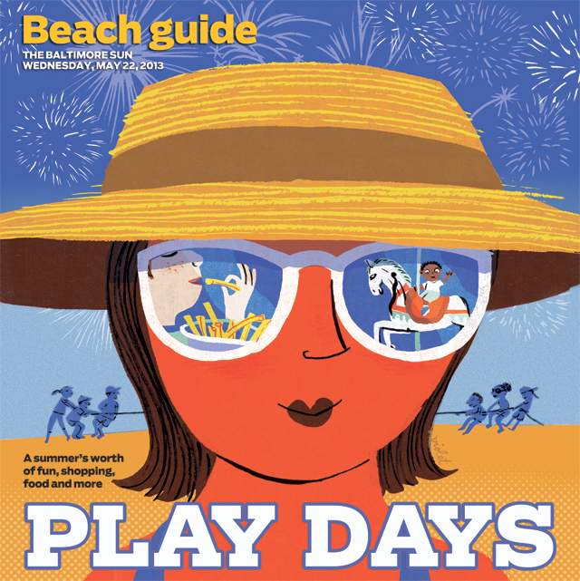
Round 1
The client provided a concept: a close-up of a lady at the beach with several items reflected in her glasses. The list of possibilities for the reflection was long, which made me nervous. I wasn’t sure how I could fit everything in such a small space, and make it read well.
I showed two options (top row) with some of the stuff on the list—fireworks and a family playing tug-of-war—in the background. In the two bottom options, I played with arranging the tug-of-war and fireworks with other items from the list (wine and sundae tasting) in the lenses. Knowing this was to be a cover, I left the top of the art fairly simple to accommodate the title, making a mental note to keep the value and color contrast up there minimal.
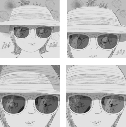
Round 2
After several days my A.D. (Tracie Rawson) responded. The folk at The Sun liked the idea of putting some elements in the background rather than in the lenses, but could I please replace the wine and sundae tasting with classic foods from Ocean City? You bet. Two new sketches:
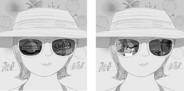
Round 3
Response: Love the kid eating fries, but the branding has to go. How about kid eating fries on one side, and carousel or roller coaster on the other?
I made options showing the carousel, the roller coaster, and (anticipating yet another change) a roller-coaster/carousel combo. But the client chose the carousel.
Round 4
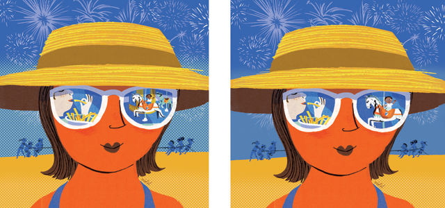 After submitting the color final (with plenty of room on all sides for the color to bleed), Tracie asked me to take out the half-tone screen in the sky behind the lady’s head, and to zoom in the carousel in the lens and tighten it up.
Because I work in editable Photoshop layers, these revisions took all of five minutes to make—it was no trouble at all—and her request improved the art. Once she began placing the type she wrote back and asked me to move my signature to the area above the curl in the lady’s hair on the right. Again, a quickie task. Not a big deal. And, as you can see at the top of this post, the result is amazing.


You are the most Brilliant and KIND professor ever. And wow, a great writer. I’m just saying…
It turned out really great! It’s nice that your original concept made it through.
Amanda Sorenson
Bits n’ Baubles Studio